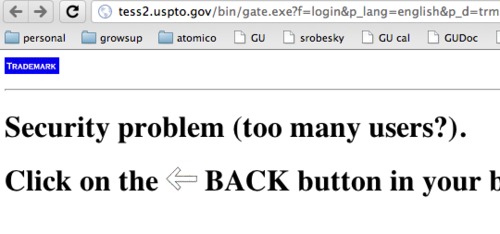
If you have ever attempted to use the US Patent and Trademark office website you are well aware that it happens to be one of the worst sites ever designed. In fact, designed would be a compliment. The site takes be back to 1995 complete with CGI scripts and beautiful error messages. I particularly enjoy that the error messages ask me questions. That is kind of cute.
Government sites should really hire decent designers and make my life easier instead of more complicated. /endrant


