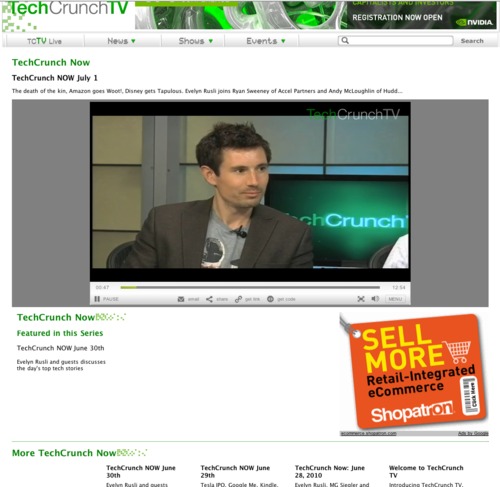
I’m watching TechCrunch TV right now, which happens to feature our good friend Andy from Huddle, but I am feeling slightly over-TechCrunched by the fact that the site is like a bowl of Lucky Charms gone wrong. There are approximately 14 TechCrunch references on the page which only has about 30 words in total. Oddly enough, for a site that seems to love its brand so much, it is missing a favicon which makes it nearly impossible to find in the sea of browser windows that I have open.
Is it just me or is this a bit much?
Not to be a total negator, I do like the video content. 🙂


