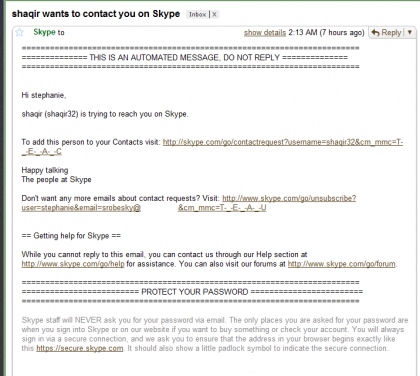
Skype recently launched a feature called “contact alert emails”. This enables people who want to contact you on Skype to send an email with a link to add them. I’m not entirely clear if this works only when you are offline or what the hell is going on and why I am receiving it. All I know is that it is intrusive and, quite frankly, really badly done.
First of all, I never opted in to any annoying emails from random people and feel like this is a violation of my privacy. Secondly, the emails are so badly done that it makes me vomit a little in my mouth every time I have received one.
Take a peak at how ugly and not useful the content of this email is:

How could this so called feature be more friendly and possibly encourage me to add the contact?
1) Come on, Skype. Can you not figure out how to send an HTML email? It is one thing to send my receipts in this ugly plain text format, but this email does not engage me or encourage me to click on anything in the least. In fact, it resembles a phishing email done poorly. Jazz it up a bit.
2) Who is this person? How about sharing a few details like their avatar, something from their profile like location and a personal message so that I can make a more informed decision about adding this person to my contact list.
3) You should have first sent an opt-in email asking me if I wanted to receive these offline alerts – with an explanation of what the hell they are. This way when I started receiving them, I wouldn’t be so confused about their purpose in my life.
Until you make this feature better, I will not be using it… K ThxBye
Any while I’m on my rant, Facebook can fix their fugly emails as well.

